Performance Optimization in AEM (Part 3): Tools and tips for capturing KPIs

Enough theory! After Part 1 and Part 2 of the series on performance optimization have dealt with the causes of performance problems and with the measurement variables of these, we will now show, using practical examples, which tools can be used to record these measurement variables. In particular, we present two tools that are available to almost every reader without further ado.


So: Open a new tab or a new window right away and try out what we have to offer here. Because for most of the following tips you don't need any further prerequisites.


Chrome Developer Tools


Perhaps one of the best friends of developers worldwide is not only in every Chrome browser: also alternatives, such as Vivaldi and Opera or the open source brother Chromium, provide the popular Chrome Developer Tools. Whether the debugging tool will be included in Microsoft's Edge browser, after the change of the base to Chromium, remains - as of now - unclear, but is to be assumed.


The Developer Tools can be opened in a similar way in the aforementioned browsers: Click on the options menu at the top right (for Vivaldi and Opera, click on the logo at the top left) → More Tools (for Opera, "Developer") → Developer Tools.

Opening the Chrome Developer Tools via menu. Usually, the Developer Tools also open via keyboard shortcut: F12 or Ctrl+Shift+i help with quick access.

Opening the Chrome Developer Tools via menu. Usually, the Developer Tools also open via keyboard shortcut: F12 or Ctrl+Shift+i help with quick access. 


Handy simulation


The first tool to better understand problems on other devices is hidden behind the second button in the upper left corner of the Debugger Tools, which symbolizes a tablet and a smartphone. After clicking on it, the page is displayed as a simulated mobile device. Simple presets for devices and connection speed can be set via the toolbar that appeared above the browser content.

Various device and network profiles allow real-world problems to be recreated in more unrepresentative environments, such as the office.

Various device and network profiles allow real-world problems to be simulated in more unrepresentative environments, e.g. in the office.


Once you have adjusted the display and loading speed of the page, you can get a first "felt" impression by reloading the page (Ctrl+R). It is important to check "Disable Cache" in the Network tab, as shown in the screenshot. This prevents the content from being loaded from the browser cache and gives a more realistic impression of how the page loads when it is first accessed.


First look at problems


A first look at the page layout - without looking at numbers or progressions - can already tell you a lot about performance problems. Especially in comparison with the competition, a look at the following criteria is worthwhile:


  • How long does the page stay blank / white?
  • What are the first visual changes that stand out?
  • What are the first interactive elements of the page that are displayed?
  • How long does it take for these elements to be displayed?
  • What animations are already playing while the page is being built?
  • Which animations still occur after the page has been built?
  • When are there no more externally perceptible changes to the page?


Those who read the last article about the Key Performance Indicators will probably already be eagerly awaiting the numbers. However, the recommendation is first to take a completely subjective look at the rendering time and compare it with other pages. Where the user experience suffers is often not only a question of numbers. For example, if the page reacts too slowly to the first input (usually a swipe or scroll down or a click on the burner navigation), this cannot be detected by the measured values.


Chrome Performance Profiles


After the first observations, which in the best case were directly written down, a first built-in tool for performance measurement during page load is offered.

Open the performance measurement function and create a measurement

Clicking on the "Performance" tab opens the "Profiling" window. Clicking on the "Reload" button reloads the page with the selected settings and starts a performance measurement. It is also advisable to check the "Screenshots" checkbox in order to be able to see more precisely at which point the page load gets particularly bogged down.

Ergebnis einer Performance Messung - Teil 1: Wasserfall und Filmstrip

Graph flood, diagram avalanche


The result is a very technical overview of the page layout, roughly consisting of 3 lines, color-coded in the following screenshot:


  • Red: power consumption of the local machine
  • Green: Timelines
  • Blue: Detailed analysis of the selected time period


By clicking and dragging in the red area, the observation period can be selected. The selected interval then becomes the data basis for the green and blue areas. By scrolling you can enlarge or reduce the observation period. In the example shown, the entire period is selected for examination.

Ergebnis einer Performance Messung - Teil 2: Main Thread und Summary

The red area itself consists of four lines: FPS (frames per second), CPU (processor load), NET (network load) and the screenshots. By hovering the mouse over the line, the screenshot at the time is displayed enlarged. This is very helpful to be able to judge the progress of the rendering of the page more precisely. In the example shown, the timeline below the red area reveals that the first image of the page was rendered after a little less than 8000ms.


The green area contains the detailed timelines for the selected area. Here again there are 7 lines, of which only the first four will be described here. Network contains all "network request-response cycles" that are necessary for rendering the page. That means, here are hidden details about all necessary resources, so called "assets", which are loaded during page load: Images, scripts, stylesheets and other data that must be used.


The second row, Frames, shows only the screenshots at the time of significant changes to the page. In our example, these are the following changes to the page:


  1. The rendering of the image
  2. Displaying the headline
  3. Displaying the navigation
  4. Displaying the correct font
  5. and 6. Rendering the cookie disclaimer

The Timings line contains the long-awaited values for the KPIs. To make the tension boil over: more about this in a moment.


First of all, details about the Main line, which illuminates the so-called "Main Thread" of the rendering in more detail. As briefly and understandably as I can: The Main Thread is the bottleneck in rendering the page. If the website were a construction site, the Main Thread would be the construction manager: Different tasks can be delegated, but, first of all, the Main thread is the fastest and, secondly, the "Main Thread" has to give its blessing at the end. Since a few years, many things can be processed in parallel in Javascript - and also the browsers are getting better and better at parsing the HTML and rendering the CSS. But it is often worth looking at the details here, because, if the main thread is blocked, many critical processes may not complete. Operations that take an exceptionally long time to execute and thus block the main thread unnecessarily are marked with red corners in the tools.

Result of a Performance Measurement - Part 3: KPIs 1

The blue area then deals with a kind of "summary" of the selected area. The pie chart "Summary" is the easiest to digest. Bottom-Up, Call Tree and Event Log are left out at this point. All tabs in this area are dynamic - depending not only on the selected time period, but also on the selected row or even the selected request in the overview for "Network". For example, if we select a cycle from the Network waterfall diagram, the Summary row changes to a textual summary containing details about the request: Speed, Methodology, Size of Data Transferred, Priority, and more. In the examples shown, the summary tab contains a pie chart.

Result of a Performance Measurement - Part 4: Summary

This diagram appears when the "Main Thread" line is clicked - but without a specific execution selected. It contains a summary of how much time was used to perform which operations. In our example, the browser is idle most of the time: Logically, we have chosen a heavily throttled Internet connection. The browser has to wait a long time for many resources to proceed with them. So here it is worth looking at a certain period of time. As soon as we select the period of the so-called first paint, a completely different picture emerges. Especially the scripting takes a lot of resources here: The Javascript has found its way to the browser and is now evaluated.

Result of a performance measurement - Part 5: Snippet

Finally KPIs


Now, as promised, the details on timings. 4 markers here signal the times of various significant milestones in the page build:


  • DCL (blue): DOMContent Loaded
  • FCP (light green): First Contentful Paint
  • FMP (dark green): First Meaningful Paint
  • L (Red): Onload Event

Disappointed? Rightly so. The expected values from the last blog article are hardly to be found here. Only the First Contentful Paint is named here. If you look at the frames at the times of the respective timings, and still remember the description of the KPIs, you might discover similarities: DCL and FCP sit about where we would talk about a First Paint. Onload is at the end - presumably at Visually Complete. But it's not quite that simple.

Result of a Performance Measurement - Part 6: KPIs 2

The more technical nature of performance analysis can be seen, for example, when looking at load events. DOMContentLoaded is a technical component of Javascript: It is triggered when the entire document is loaded and parsed - without waiting for dependencies. Load and Onload are only triggered when all dependencies have been loaded, including images, styles and scripts.


In this article, as well as in the last articles, the main focus has been on the performance of the page layout, also called page rendering performance. However, it can also be a problem that individual components of the page do not react quickly enough, are not responsive or give a bad image of a website and its components due to jerky responsiveness. This is referred to as page interaction performance. If you want to identify problems here, you can also use the performance profiles of the Chrome Developer Tools, which can record and track your interaction with the page. To do this, you can press the red record button while using the page; all of the above analysis components are then recorded by the tool in the same way as during page loading.


Lighthouse / Audit


This shows that the performance analysis of the Chrome Developer Tools is not aimed at analysis fans, but at developers. If you want to get closer to reporting, there is another powerful tool hidden in the Chrome Developer Tools: Audits - also called "Lighthouse".

The Google Audit Tool / Lighthouse

The audits tab is sometimes hidden behind the small arrows at the end of the tab bar. Once you have opened it, you can choose from a limited amount of speed and device configurations. A test on "Mobile" is offered, as well as a throttled speed. Besides the display size and the connection speed, the CPU speed is also reduced during the audits.

Start of a measurement with audit

After clicking "Run Audits", the test is executed. The page is displayed in a smartphone and rendered several times, in different ways, to collect detailed information about the page. After a short time, a clear, rich report is displayed, which provides information about any problems with the page. This also includes the long-awaited measurement values, which now also partly coincide with the previously discussed measurement values.


Result of a measurement with Audit / Lighthouse

In our example, we get acceptable values for the numbers "First Contentful Paint" (1.4s), "Speed Index" (1.6s), "First Meaningful Paint" (1.6s) and "Time to Interactive" (3.4s).


Clicking on "View Trace" opens the measured values in the Performance Tool known from the previous section. Time to Interactive can be understood as an analogy to Visually Complete.


First look at solutions


In addition to the results for the performance metrics, the report also contains readable, insightful advice on what actions can be taken to improve performance. Recommended measures in this case include using more modern image compression algorithms and optimizing the utilization of the main thread. More on this will follow in the other parts of this series.

Approaches to solving Lighthouse performance problems

In addition to performance, the audit tool also looks at the accessibility of the website. In view of the increasingly widespread WCAG standards and the severe penalties that non-compliance with them could entail in the future, these results are also of growing relevance for both technical and non-technical decision-makers.


Webpagetest


One tool that can provide valuable insight into a site's performance, regardless of browser and environment, is the application hosted at www.webpagetest.org, which is connected to and used by numerous companies worldwide. The free open source tool, whose code can also be operated by the user, offers a range of functions and configurations that is hardly comparable - one should not be put off by the somewhat antiquated presentation.

Webpagetest.org: Homepage

The first three tabs above the main input field provide access to the most important functions. In the following, only "Advanced Testing" and "Visual Comparison" will be discussed, as these are the central features for comparability and finding vulnerabilities.


Testing on real devices


A click on the dropdown below the input field for the URL indicates the almost insanely large scope of the test functions. From a dropdown, one can select one of dozens of devices that are available to the system distributed all over the world. From the contingent of the operator in Dulles, Virginia, even real Android and Apple devices can be selected for the tests. It can happen that the screenshots of a test are covered by Android system error messages. However, this only happened once with an application over a period of more than 12 months.

Webpagetest.org: Selection of devices

It makes sense to choose one of these pre-selected scenarios. As a rule, you know the target group that you want to optimize, comparability with future and other tests is also desired, and the complexity should not be immeasurable. However, if you want to go into more detail, you can also open the Advanced Settings. Here, any authentication can be configured, and individual resources can be excluded from the test. One of the more important functions of the Advanced Settings, however, is the configuration of throttling the line and simulated mobile devices, analogous to the Chrome Developer Tools. You can even create your own metrics using small script snippets.


Before we discuss a test and its result, one more note: As long as we do not operate the application ourselves, the resulting data is of course no longer in our own hands. So we always feed the operator's data collection with it as well. If we don't mind, we select a device, enter a URL and start the test by clicking the yellow button labeled "Start Test". For our test, we chose a Chrome browser from Brussels, without a throttled connection, and without a simulated screen size. As a default configuration, three tests are executed, and their mean (median) value is displayed after execution. You can view such a test here.


A click on "Details", opens the detailed test result. The most important part of the test is in the headline and in the first line. Next to the headline, six categories are rated according to the American grading system: Time to First Byte, Compression and Caching, cover five of the six categories in different values. The sixth value is "effective use of content delivery networks". If you do not deliver your website via a CDN, you will get an "X" as a result, as in our example. Clicking on the scores takes you to a page that explains the assessment in detail and from which, in turn, possible solutions can be derived.

Webpagetest.org: Results

The first row of metrics now fills in the last gaps related to the desired KPIs. Time to First Byte, Start Render (First Paint), Speed Index and Visually Complete, are listed just as Document Complete and Fully Loaded. Below the numbers is the Waterfall View, which includes a detailed description of all connection and transfer times for each component of the page. The Connection View, one level above, deals with the connection times for the various domains addressed. With the help of this overview, problems with "3rd party providers" or CDNs in particular can be identified.


You can get back to the basics of the measurement by clicking on "Summary". There, in addition to the abbreviated "Performance Results", you will also find the "Content Breakdown", which shows in pie charts which parts of the page cause how much load. "Load" does not only mean how many bytes are transferred, but also how many requests are necessary to load all resources.

Webpagetest.org: Finally pies!

The various other links above the test result lead into the real depths of the analysis, the content of which would definitely go beyond the scope of this article. One last point that is important to mention, however, is the "Filmstrip View" that is hidden to the right of the test's screenshot. This "Filmstrip View" contains the expected screenshots - every 0.5 seconds by default - as well as other valuable diagrams about load and timings. These diagrams are analogous to those presented in a "Visual Comparison".


Visual Comparison


Webpagetest offers another very powerful tool for comparing website performance: Visual Comparison. This not only makes it easier to look at the competition, but also to compare variants of one's own homepage. For example, you can compare the homepage with a campaign page, different country clients from the same location, or the new beta.beispiel.de with the old beispiel.de.

Webpagetest.org: Visual Comparison

By clicking on the corresponding tab "Visual Comparison" the input field with label and URL is shown. By clicking on the "Add" button, you can add more such input fields. Below the input fields there is a dropdown that allows throttling the speed. After entering several URLs that are suitable for a comparison, the test can be started again by clicking on the yellow button labeled "Start Test". A loading window provides information about the progress of the test.

Webpagetest.org: Visual Comparison during execution

After all tests have been completed, you will be redirected to a relatively bulky results window that displays the screenshots of all tests - four in our example - on top of each other. In this window, called "Filmstrips", the program automatically scrolls to the point where the first visible render progress was made. The progress is marked with yellow frames (shown again in yellow in our screenshot).

Webpagetest.org: Visual Comparison - Results

So we have a first winner: the first look reveals in which of the comparison candidates something happens the fastest and our users get the first feedback. By scrolling on the vertical bar marked in red in the screenshot, you can navigate further through the hundreds of frames long film strip. Below the images, the visual progress is listed as a percentage. This data is also displayed in a graph further down the page. If you scroll a little further in our example, you can see that progress is only visible after 10 seconds for all candidates.

Webpagetest.org: Visual Comparison - Results

Here you can also see differences in the loading strategies of the websites. While the Süddeutsche Zeitung started with navigation and headline image, the headlines and articles appear first on the TAZ and FAZ before the images are reloaded. Die Zeit builds the headline, article and cover image directly in the first rendering, but then pauses at 37%. Süddeutsche and FAZ also remain at 35% and 45% respectively for a long time, while TAZ, which is rather leisurely, is the first to complete its loading process: 100% after 10 seconds. As can be seen from the screenshots, the TAZ is the only one of the four comparison objects that is not targeted by an apparently broader campaign for the BMWi's start-up offensive. This campaign takes up almost the entire viewport of the page and thus significantly disrupts the page load. This may be positive for the KPI Advertising Revenue - but for the KPI Speed Index and Visually Complete it is a disaster. In order not to impair the performance, a technical integration of the advertising directly into the page would be of great advantage: The markup, images and scripts of the advertising could be prioritized, placeholders rendered. However, since advertising is mostly placed via third-party partners, the loading and rendering strategies of this advertising are not in the hands of the website operators. Every reader who has dealt with the trade and implementation of advertising on the Internet knows that this problem will not be solved very quickly: For the foreseeable future, campaigns will certainly not be negotiated directly with the websites that place them - and certainly not directly integrated there.


If you scroll down past the results window, you will find a waterfall diagram in which the results of the four tests can be compared. Small sliders above the diagram can be used to increase or decrease the transparency or visibility of the various comparison candidates. For a detailed analysis, this diagram can also be helpful - especially when looking at the first processes in the diagram: How long does it take until the first HTML is downloaded? What infrastructural problems do we have in resolving the domain name?


At least two more blog articles could be written about waterfall diagrams, which have already been briefly touched upon in Chrome Developer Tools. For those who want to delve deeper into the topic, the blog article linked here is recommended.


Below the waterfall is the Visual Progress chart, which compares the render progress of all candidates. This illustrates the observations from the film strips via a simple axis diagram for time and visible render progress. While Zeit has actually provided all relevant information after just under 4 seconds and Süddeutsche Zeitung after almost 6 seconds, taz sets itself apart from the competitors after 9 seconds, as they now consume further resources and time to place the ad.


Webpagetest.org: Visual Progress comparison

The graph also contains the first indication of the speed index. The area above the respective graphs is used to calculate this. A better overview of the comparison of the different KPIs can be found in the next graphic. The Timings (ms) shows a comparison of all values recorded by webpagetest.org. By hovering over the bars, the exact value is displayed. Differences can already be seen in the Time to First Byte, which continue in the other measurements. Speed Index and Visually Complete are particularly relevant, however. With the KPIs Hero Image, Hero Heading and Hero BackgroundImage, webpagetest also wants to show which pages display particularly relevant content the fastest. However, if there is no Hero Image - or if it is not recognized by webpagetest - these figures cannot be recorded. This also explains why only FAZ and taz have a value for this in this comparative measurement.

Webpagetest.org: KPIs in comparison

The last two charts look at the request and byte load required to render the page. These are particularly good at identifying which assets may be causing an extraordinary amount of load when compared to other competitors. They also provide information about whether assets such as scripts and images are prioritized correctly and load the page in the right order. The website that has the worst performance in our comparison test also has the highest value in the total load - so far, so expected. However, the website with the best performance values follows directly behind in the total load values. Thus, various things seem to have been done correctly here, as far as the loading and rendering strategy is concerned.


One important reason for this is probably the advertising that is not displayed - but this should not be counted out. For the user experience, such a disruptive experience when the ads are displayed is, of course, extremely relevant. We also see that the amount of bytes transferred for images and fonts is highest in the "test winner": There is probably still further potential for optimization here. Another reason for the good values seems to be that the programmers of the web application have held back on scripting: the website has by far the lowest load of Javascript files. Some unnecessary gimmicks in menus, slideshows or other interactive elements were probably left out here - to the advantage of the site's performance.


Webpagetest.org: Payload in comparison

With all these tools, problems can be formulated wonderfully, the field of competitors can be analyzed, KPIs and measurements can be visualized and the first causes can already be identified. If all this is not enough for the PowerPoint presentation in the internal escalation meeting, there is another very useful tool hidden under the filmstrip view behind a button so small that it could almost be called hidden: The comparison video. This video has the potential to clarify the last questions clearly, because it makes the annoying sideways scrolling in the filmstrip view unnecessary and summarizes and visualizes the performance values.

Webpagetest.org: Create video

For each comparison candidate, the video stops at Visually Complete and turns gray. The value in seconds is displayed below the last screenshot. Furthermore, the differences in the page structure can be observed even more precisely. Our example shows that the KPI "Visually Complete" is only reached for the FAZ when the reference to the Android app is displayed. In the internal meeting, this could lead to two positions: 1.: We need the hint, so our new KPI to be optimized will be the "Speed Index" - and not Visually Complete. Or 2: If we turn off the hint we improve by 10 seconds without any effort. As mentioned in the last part: bare numbers alone don't always just give the insight. Which of the two measures mentioned above are taken depends largely on who looks at which reports and who creates them, whether both sides understand the numbers - and whether they sit together in the meeting.


Persisting the results


Once the results are collected, they should of course be preserved - to be reused as reference points at later times and to make progress measurable. For this purpose, webpagetest offers a data export as csv or in HTTP Archive Format (.har) - a json encoded archive containing the results of the measurement. The Chrome Developer Performance Profile, on the other hand, can be exported directly from the Developer Tools as json and then imported again there.

Export and import of a .har file in Chrome Developer Tools

In the Developer Tools, this function is hidden between the record buttons and the URL: "Save Profile..." allows exporting the JSON file, "Load Profile...", importing and displaying the saved results in the Performance window.

Export of data from webpagetest

Webpagetest does not make exporting the data much more difficult. In the Summary tab, as well as in the Details tab of the measurement, there is a small area for data export in the upper right corner. If you want to access the details of an individual measurement via the Visual Comparison, you have to click on the previously assigned label to the left of the filmstrip. An export in .har format, which has been downloaded after clicking on "Export HTTP Archive (.har)", can then be visualized on the page http://www.softwareishard.com/har/viewer/, for example: Again, you get a waterfall view of the page structure with a red line marking the load event.

Webpagetest Data in Excel

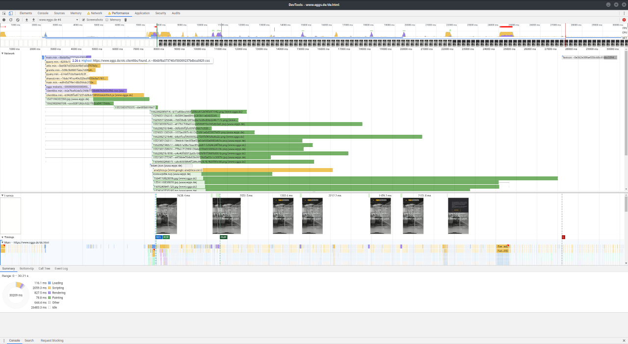
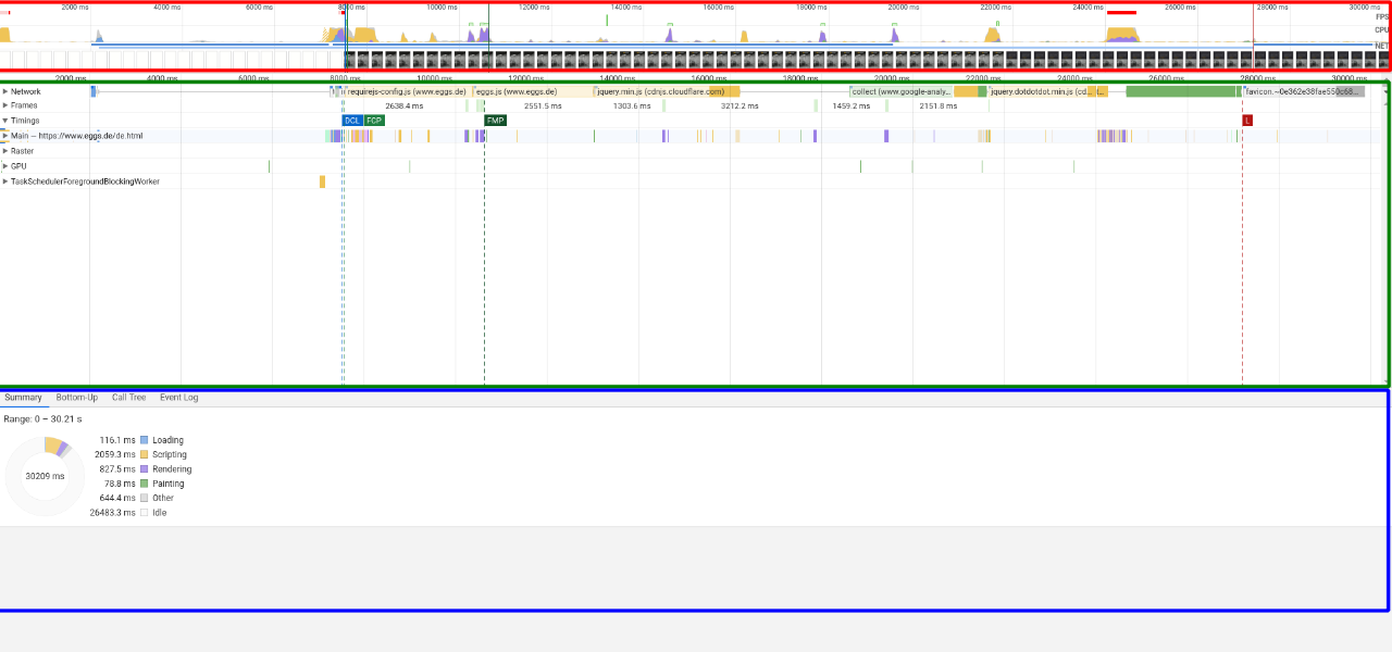
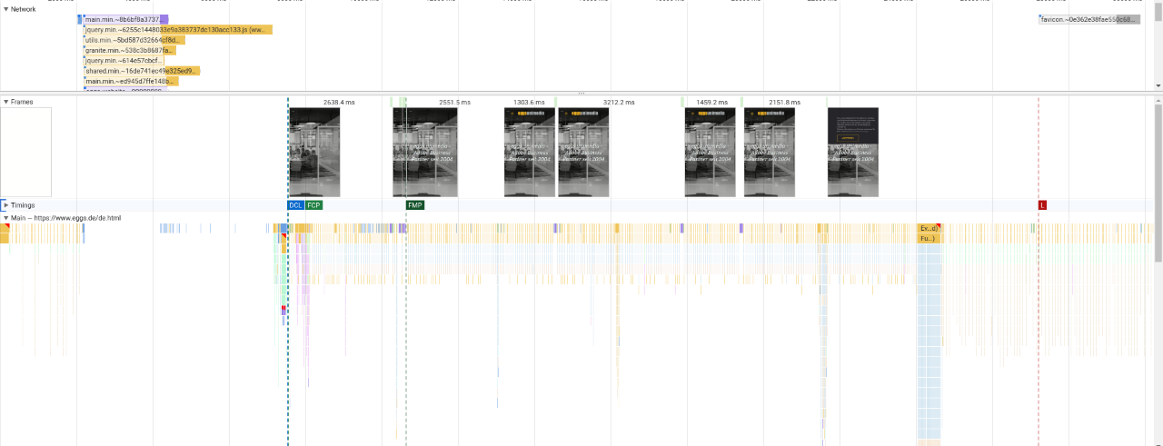
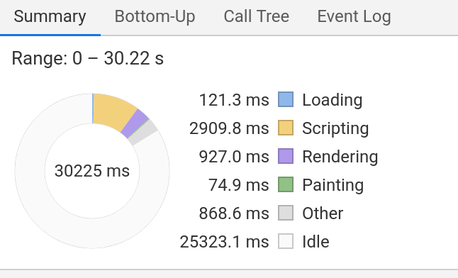
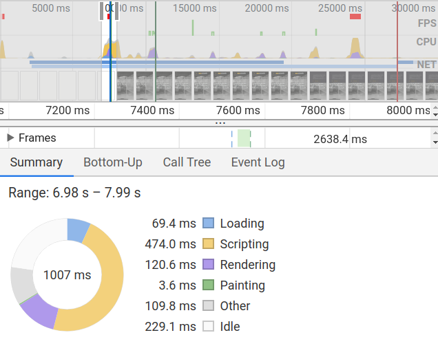
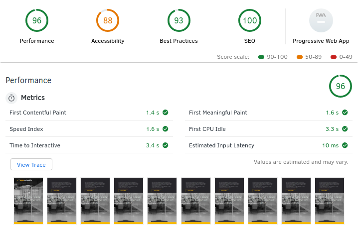
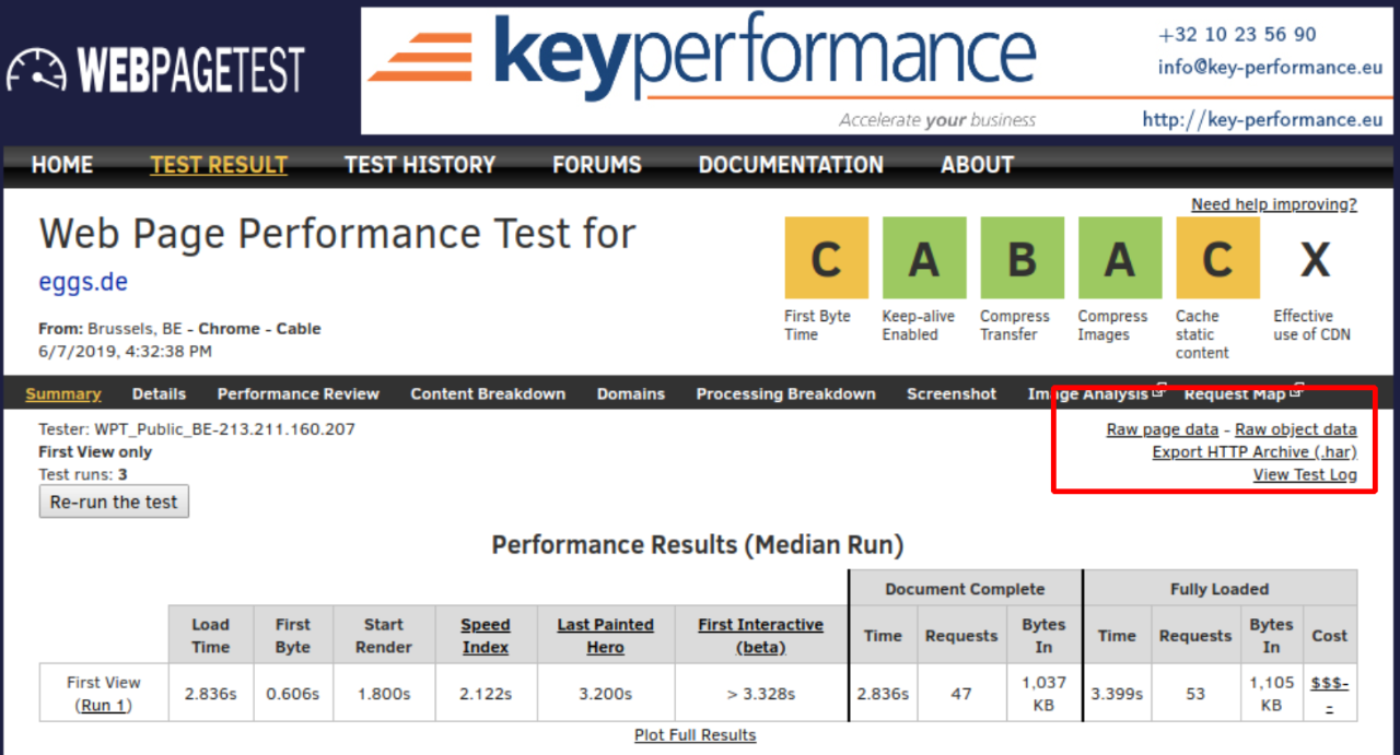
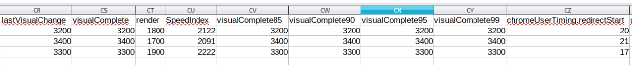
If you want to persist the values of the KPIs, you can export the test data as CSV: Click on "Raw Page Data" to start the download. The spreadsheet program then displays all the data collected for the web pages in extremely long rows. However, relevant fields such as visualComplete and SpeedIndex can usually still be found easily.


However, a certain data persistence, even if not controlled by the user, is given anyway when testing via webpagetest.org: In our test, old measurements were still available after more than a year. The data exports in .har and .csv format should therefore be made to be on the safe side, but keeping the links to the test results is also a good idea and should probably suffice as a reference over a longer period of time.


Monitoring


Due to the wide range of functions of the tools mentioned above, numerous data can be collected, which should be sufficient as a basis for discussion for most purposes. The clearly prepared comparisons of webpagetest with the competitors as well as the manual comparisons of past and current test results also provide a large and very helpful basis for analysis. However, the more complex a web application becomes and the more partners are involved, the more risk there is that unexpected peaks will occur that cannot be caught by selective measurements. If you want to establish a continuous monitoring of the site under performance and reliability aspects, you cannot avoid spending money. With the webpagetest API, you can certainly develop a great application yourself that continuously triggers measurements and presents the results in a visually palatable way.


But for this you definitely need at least time, knowledge, manpower and your own server. If you don't want to do this work, the already well-known tool GTmetrix also has variants that require registration but are free of charge, which have already done exactly that for you. When it comes to monitoring, however, one inevitably moves more and more in the direction of commercial providers who offer comprehensive packages ranging from simple monitoring and notification systems in the event of load time peaks or outages to entire teams that advise, develop solutions and, if necessary, even implement them.


The "Application Performance Management" platform Dynatrace should at least be mentioned here, whose scope of services ranges from synthetic and real user monitoring of frontend performance KPIs to the tracking of hardware key figures in AWS. The data can be linked to consulting offerings and visualized in configurable dashboards. Dynatrace's offering, as indicated, is vast and complex. Against this complexity and also the cost of the tool, the need for performance issues must of course be weighed.


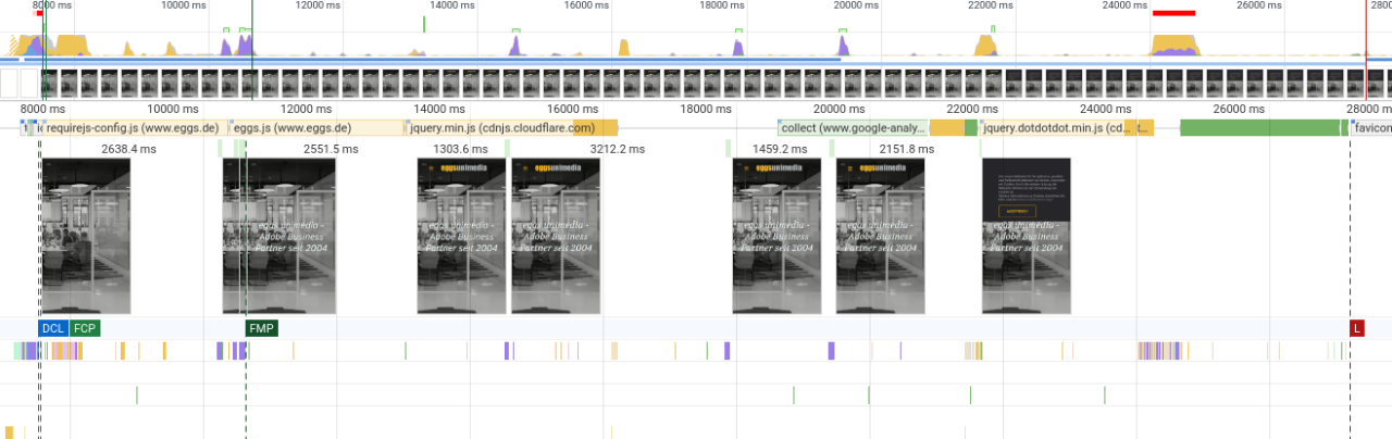
The Calibre tool, which collects measurements and saves filmstrips at configured times, offers less functionality but also less complexity. If no additional manual effort is desired, this tool can also satisfy the need to visualize improvements - for example, only for an intermediate phase between several releases.


If you are looking for more tools, this article by keycdn is recommended: https://www.keycdn.com/blog/website-speed-test-tools, which presents some more interesting tools for evaluating performance. Especially the reports from GTmetrix and pingdom have proven to be clear, comparable and informative.


However, as there will continue to be a lot going on in the segment of web development and the optimization of their products, it is worth taking a regular look at new tools and developments.